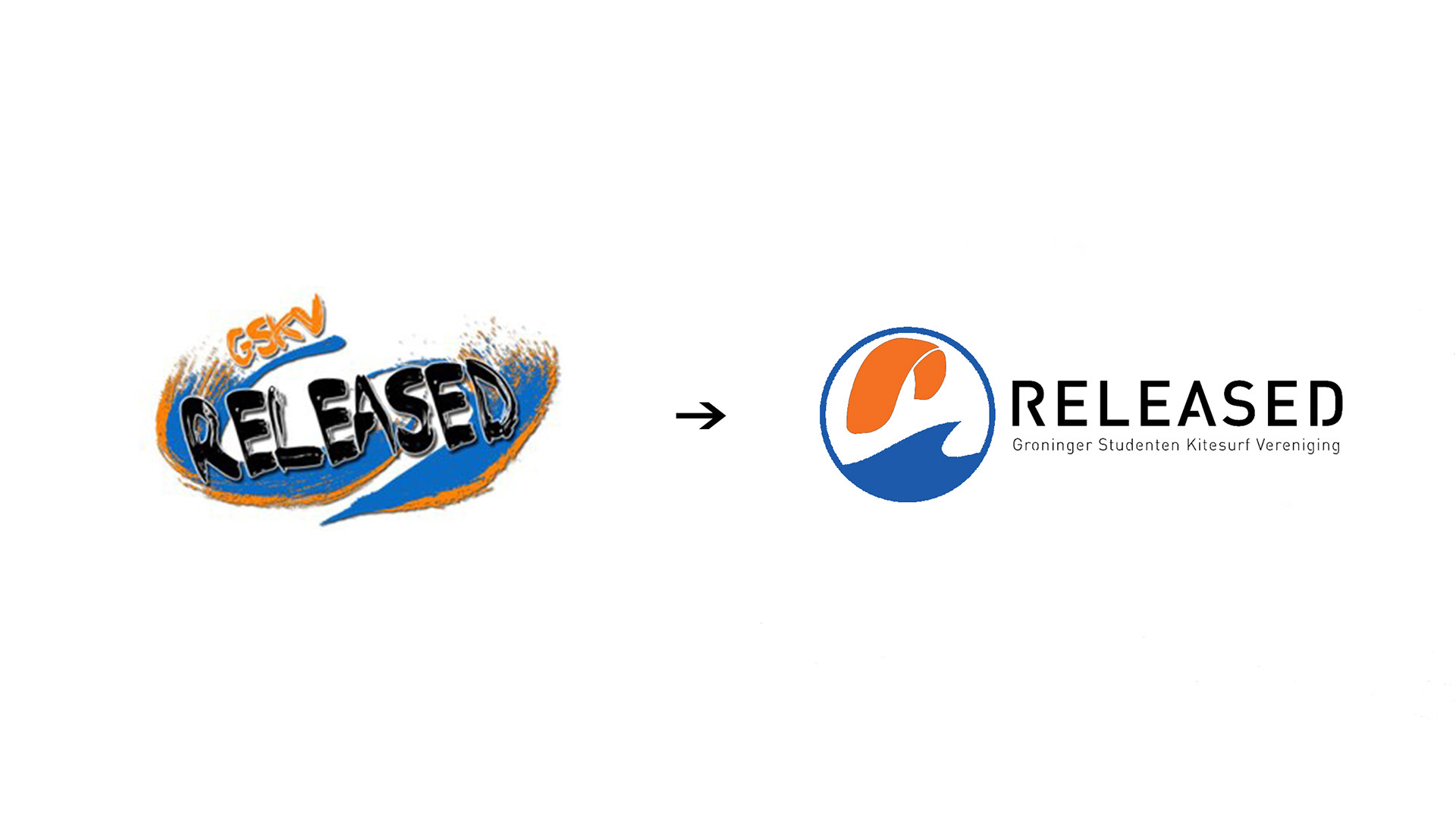
After becoming a member of the student kitesurfing club in Groningen, I was asked if I could simplify the old logo. After bringing the old logo down to 4 colors we decided that a completely new logo would be much nicer. The hard part was that the club needed to have a say in how they wanted to see the logo.
After a long process of discussing what style to go with and how the logo should look and a big pile of ideas from many club members, I started working on a concept. The final concept came to me on one of the clubs gatherings in de our usual bar. The classic drawing on a napkin became the clubs new logo.